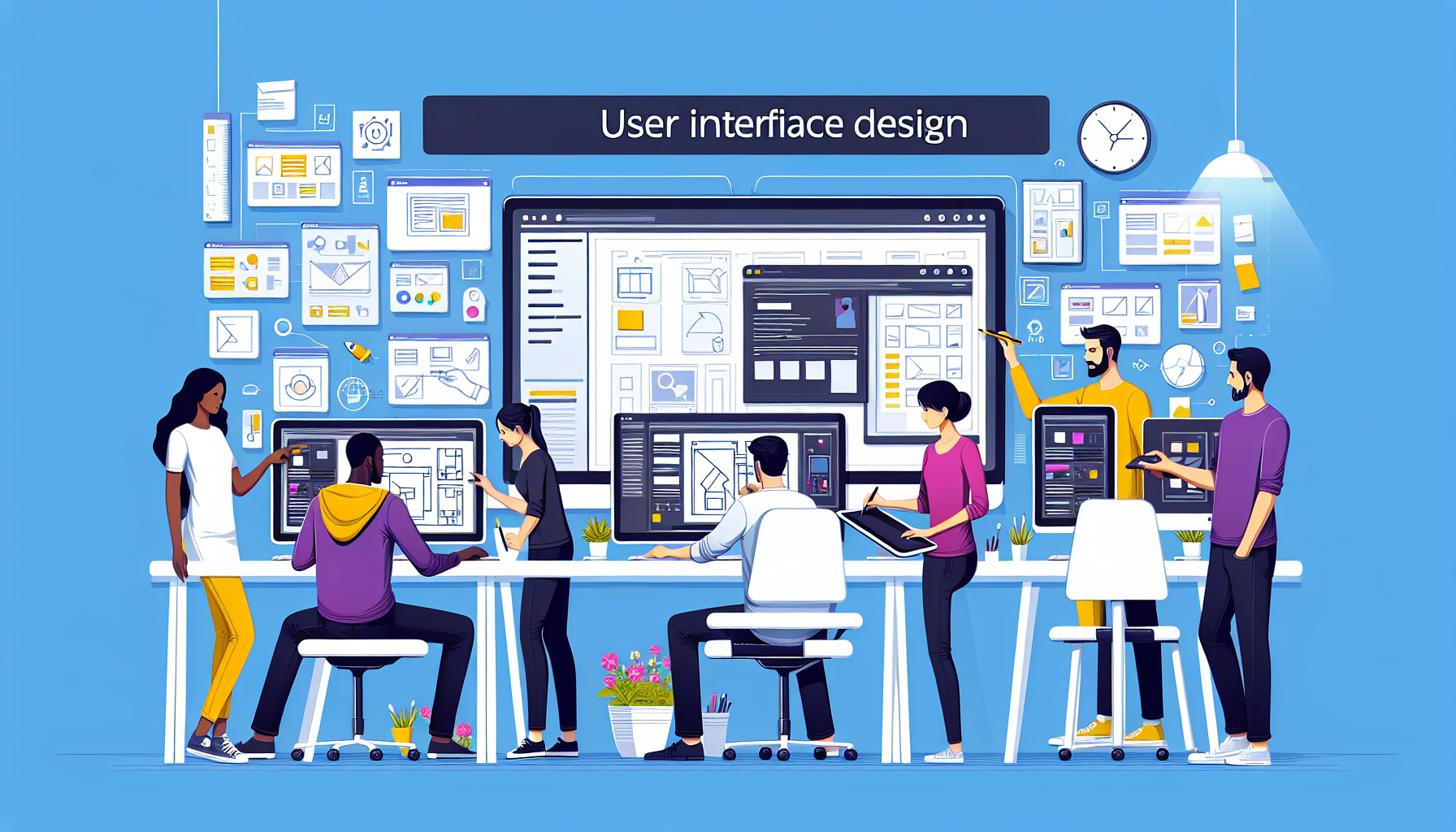
Understanding the Basics of User Interface (UI) Design
User Interface (UI) Design is a critical aspect of creating a user-friendly, efficient, and enjoyable digital experience. The basic principles of UI Design focus not only on the aesthetics of a user interface but also its functionality and usability. At its core, UI Design is about the intuitive navigation of any digital product, may it be a website, app, or a software application.
Clarity is the cornerstone of good UI Design. When users interact with a UI, they should be able to recognize what it is immediately and what they are expected to do. This involves a clear visual hierarchy, the use of familiar icons and buttons, and the implementation of a coherent color scheme that guides and informs the user. Consistency across the platform maintains the user’s comprehension from one interaction to the next, enhancing the overall user experience.
Furthermore, an effective UI Design must account for responsiveness. With a multitude of devices at our disposal, ensuring that interfaces perform seamlessly across different screen sizes and resolutions is essential. A responsive UI should adapt to various platforms without losing its functionality or compromising on its visual appeal. This adaptability makes sure that the user’s journey remains uninterrupted, regardless of the device in use.
Accessibility is also a pivotal component of UI Design. Designing for a wide range of users—including those with disabilities—ensures that a product is usable and enjoyable for all. This involves considering text size, color contrast, and navigation ease which can greatly impact users with visual or motor impairments. Implementing these inclusive practices not only expands the reach of the product but also reflects a company’s commitment to diversity and respect for all users.
Principles of Effective User Interface Design
When it comes to user interface (UI) design, the core objective is to create interfaces that users find easy and pleasurable to use. The principles of effective UI design are grounded in enhancing user experience by harnessing simplicity, consistency, and clarity. Implementing these principles can profoundly influence the usability and functionality of an application or website, fostering user satisfaction and engagement.
Clarity is the first and foremost principle among UI design best practices. A clear UI will guide users intuitively to navigate through a system without making them think excessively. Clarity is achieved through the strategic deployment of familiar icons, coherent typography, and a sensible hierarchy of elements. The principle of clarity ensures that users can discern actionable items from informational text and effortlessly comprehend how to interact with the interface.
Consistency is another pillar of sound UI design. Consistent interfaces allow users to rely on their prior experience from one part of an application to another, significantly reducing the learning curve. This includes maintaining uniformity in visual elements, such as colors and fonts, functional elements like button actions or gestures, as well as internal and external consistency with established conventions or other products within the same brand or platform.
Moreover, simplicity should remain at the heart of UI design. The principle of simplicity calls for the elimination of any unnecessary elements that do not support user tasks. Keeping the design simple not only contributes to an aesthetic minimalism but also aids in focusing the user’s attention on core functionalities, minimizing distractions, and making the learning process swift and intuitive. By prioritizing simplicity, designers can create a user interface that is both aesthetically pleasing and highly functional, enhancing the overall user experience.
Best Practices for Modern User Interface Design
When it comes to crafting a seamless and efficient user interface (UI), several key principles must be adhered to. The goal of modern UI design is to create a user-friendly experience that is intuitive and reduces learning time for the user. Consistency is paramount; it entails using common UI elements across the application, which helps users quickly become familiar with the navigation and functionality. Keeping interfaces simple with clean lines and minimalistic design not only reduces clutter but also emphasizes the content and purposes of the UI, allowing the users to focus on their tasks without distractions.
Another crucial aspect is responsiveness. Today’s users access applications across a range of devices, each with varying screen sizes and capabilities. Modern UI design must ensure that the interface can adapt to any screen, providing a coherent experience whether on a desktop, tablet, or smartphone. Designers can employ flexible grid layouts, scalable vector graphics, and media queries to ensure compatibility and usability across devices. The emphasis on mobile-first design also helps prioritize content and functionality for smaller screens, which can be scaled up to fit larger desktop displays.
Furthermore, the accessibility of a UI is a significant consideration; it is essential to design for all types of users, including those with disabilities. This involves adhering to Web Content Accessibility Guidelines (WCAG) by including features such as keyboard navigation, screen reader support, and sufficient contrast ratios. Providing alternative text for images and ensuring that all interactive elements are clearly labeled also play a part in creating an inclusive interface. In fact, building an accessible UI improves the overall user experience and can also positively impact SEO.
Lastly, leveraging the power of visual hierarchy can guide users through your UI in a strategic way. By manipulating size, color, and layout, designers can draw attention to the most crucial elements first. This order of importance ensures that the users’ pathway through your UI is as efficient as possible, leading them naturally from one element to the next. H3 tags can be used effectively within HTML content to establish a clear structure and aid in the navigation, such as
Important Elements to Consider
Accessibility Features
Or, breaking up sections of content in a meaningful way. Additionally, user interfaces that incorporate feedback mechanisms, such as subtle animations or hover effects, provide valuable cues about the system status, enhancing the overall interactivity and responsiveness of the UI.
Tools and Resources for Aspiring UI Designers
As an aspiring UI designer, the journey begins with equipping yourself with the right set of tools and resources. The digital landscape is vast and packed with a plethora of applications and platforms designed to enhance creativity and streamline the design process. Foremost in the toolkit of many professionals is Adobe XD, a powerful vector-based application that facilitates wireframing, animation, prototyping, and collaboration all in one. Its intuitive interface and seamless integration with other Adobe products make it an indispensable resource for UI designers at any level.
To complement the heavy lifting done by design software, UI designers often turn to online resources like Sketch and Figma. Sketch has long been revered for its simplicity and focus on screen design, which blends perfectly with its extensive library of plugins and integrates with a myriad of third-party tools. In contrast, Figma shines in realtime collaboration, allowing multiple designers to co-edit and view updates live across different devices; this well-positions Figma as a favorite for remote teams and freelancing professionals. These platforms not only provide the canvas for design creation but also foster a community where templates and design systems can be shared and improved upon.
No UI designer’s arsenal is complete without a keen understanding of typography and color palettes, and resources like Google Fonts and Coolors are treasures troves that aid in this aspect. Google Fonts offers a wide array of typefaces that are free and easy to integrate into any web-based project, ensuring that readability and visual impact are within reach. Coolors, on the other hand, generates color schemes in an instant, helping designers to create visually harmonious interfaces that can engage and resonate with users.
Lastly, staying up-to-date with the latest UI trends and techniques is crucial, and that’s where online learning platforms like Udemy, Lynda, and Coursera step in. They provide a wealth of knowledge ranging from beginner to advanced levels, covering topics such as user interface principles, usability testing, and responsive design. These platforms are especially useful for self-taught designers looking to formalize their knowledge or learn new specialist skills that are sought after in the industry.
Analyzing Real-World Examples of Excellent UI Design
When it comes to creating an exceptional user interface (UI), real-world examples provide the most valuable insights. Companies that have excelled in UI design often share a common trait: they place the user experience at the forefront of their design process. For instance, consider the clean, minimalist layout of Google’s search engine. The simplicity and ease of use are why it has become the go-to platform for information seekers worldwide. The low cognitive load and clear visual hierarchy guide users intuitively to the most critical function – search.
Another real-world example that epitomizes excellent UI design is the intuitiveness of smartphone interfaces. Take the iOS interface for example; the use of familiar symbols, cohesive color schemes, and responsive touch controls makes navigation nearly second nature. Apple’s attention to detail and consideration of how users interact with their devices have set a benchmark in UI design. This seamless integration of design and function underscores the success of their products, as users can focus on accomplishing tasks rather than figuring out how to use the device.
Moreover, the success of streaming services like Netflix can be partly attributed to their outstanding UI design. Netflix’s interface is formatted to foster effortless content discovery and enjoyment. Bold visuals, combined with a predictive algorithm that aligns with user preferences, creates a personalized experience for each user. The platform’s UI is a stellar example of how catering to users’ desires — through easy navigation and a visually appealing layout — can result in increased user engagement and satisfaction.
Add to this the powerful e-commerce platforms such as Amazon, which displays an exemplary blend of functionality and accessibility. The UI design is structured around user habits and ease of shopping, from the search bar’s prominent position to the clear and concise product descriptions and ratings. What makes Amazon’s UI remarkable is its ability to handle complex inventory and user options while maintaining a straightforward path to purchase. By placing importance on user-centric design, Amazon has mastered an interface that drives both user retention and business growth.